
Volume 44: August
COLORFUL MOMENT IN THE PRESS

FRESH FINDS
I just returned from Las Vegas Market, and there is nothing quite like walking showroom after showroom to get excited about what is happening in furnishings and accessories. There is a lot to see, and between the Vegas heat outside and some surprisingly chilly showrooms, I spent most of the day going from one extreme to the other.

WHAT CAUGHT MY EYE
Texture, warmer woods, natural materials and some really good color. Neutrals are definitely not going anywhere, but they are feeling warmer and more interesting. Think nubby fabrics, woven details, dimensional finishes and layers of texture that keep a neutral room from feeling flat. I also saw plenty of medium wood tones along with a mix of varied woods, which I love. They bring warmth into a room without everything needing to perfectly match.
AND THEN THERE WAS BURGUNDY
Deep, rich burgundy showed up in a few showrooms in both velvet and leather, and I am here for it. It feels sophisticated and cozy, especially heading toward fall, and it is such a great way to add moody color. A burgundy velvet chair? Yes, please.
Of course, Market is also about finding those smaller pieces that make a room feel collected. Fresh accessories in interesting shapes with artful glazes and finishes, woven lamp shades and natural materials. Those are often the things I get most excited about because they can completely shift the personality of a room.
AND SPEAKING OF COLOR
We also have something pretty exciting happening a little closer to home.
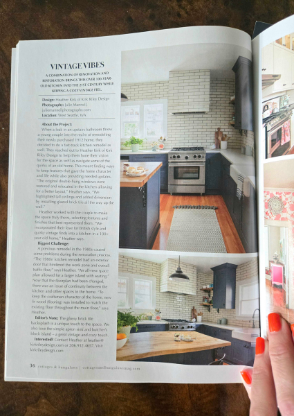
Kirk Riley Design is featured in print in Cottages & Bungalows magazine!
Not just once, but with two colorful kitchens we designed, which makes me especially proud. Color has always been such an important part of how I approach interiors. Seeing these projects, and our clients' homes, beautifully photographed by Julie Mannell and featured on the pages of a national magazine is pretty darn exciting.
Both kitchens are very different, but each is a great example of something I believe strongly: your kitchen does not have to be white, gray or completely neutral to have staying power. Color can give a kitchen personality and a sense that it truly belongs to the people who live there.
Between seeing what is new at Market and seeing our own colorful work in print, I am feeling very inspired heading into the next season. And if you are suddenly thinking your home could use a little burgundy chenille, you know where to find me.
Please check out more of our work in our portfolio, follow us on Instagram, or get in touch to start your own transformation. Thanks for following along!
